Blog
Government Branding Is More Innovative Than You Might Expect
- Trademark Solutions

Many people associate government branding with a slogan or a tagline, usually in support of tourism initiatives (e.g., Incredinburgh, I ♥︎ NY, I Feel Slovenia), but there’s another layer of government branding that brings together design elements to produce a city, town, or country’s visual identity system used in signage, flags, maps, logos, etc.
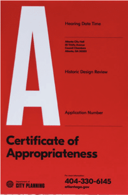
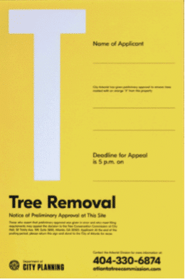
Take, for example, Atlanta, Georgia. The southeastern US city recently rebranded its Department of Planning and Community Development with a new name, a new look, and some very distinctive public notice signage. As Fast Company writes, “Not all cities have a budget for design, but Atlanta’s department of urban planning is showing why they should.”
The department is now officially called the Department of City Planning and not only is the new name clear and simple, but the entire rebranding project aligned around the phrase: “To Be Clear Is To Be Kind.” In the words of creative director Blake Howard, quoted in Fast Company: “If we want to be kind to the public we serve, we need to be clear.”
The result is that there are no more wordy government-looking public notice signs in the city. Those signs often require a lot of legal language, which limits the amount of editing that can be done, but there are no restrictions on breaking up the words and using different font sizes to make them easier to read. Now Atlanta’s new identity system, created by agency Matchstic, features colorful, modern signage for everything from tree removal notices to announcements about public hearings. Take a look at these examples:
You can read the Matchstic zoning signs redesign case study here.
In the United States, the trend toward improving government signage began, as Fast Company points out, during the 1970s when “good graphic design was a national priority — and the story of how it became one is a forgotten chapter of design history.” That’s when US federal agencies and departments — from NASA to the National Park Service to the US Postal Service — all redesigned their visual identity and communication systems, often with the help of famous graphic designers.
It was during this time period that the NASA “worm” logo came into existence:
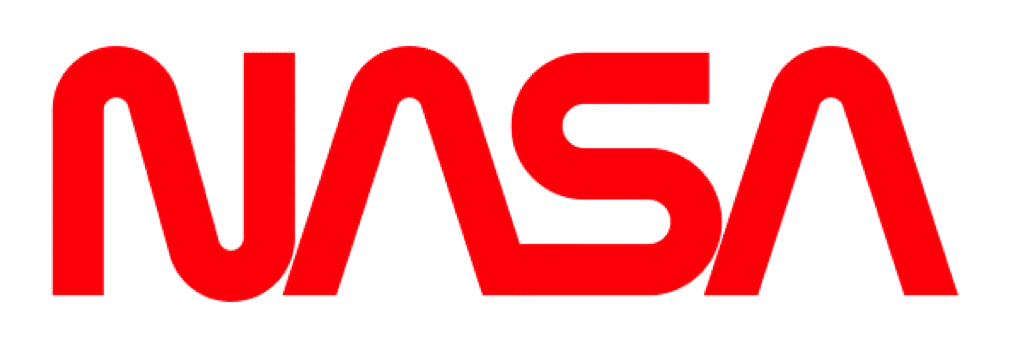
Surprisingly, the person behind this national design push was then-President Richard Nixon. During Nixon’s administration, supporting the arts was considered “good politics” and responsibility for federal design fell under the National Endowment for the Arts (NEA). So Nixon increased NEA funding and new NEA chairperson Nancy Hanks created the Federal Design Improvement Program to deal with government agencies requesting both better graphics and better offices. And so, money became available for the government to hire designers to improve visual communications, including the standardization of federal highway signs.
Nearly 50 US government agencies ended up with new visual identities during this productive redesign effort. You can read more fascinating details in the Fast Company article here.
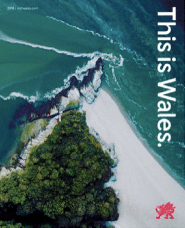
In more recent government branding projects around the world, Wales rolled out a rebranding project for its tourism, business, and food and drink markets with a redrawn national dragon symbol referencing the Welsh flag. The flag’s “painterly” red dragon has been updated with a more graphic representation of a dragon. Check it out:
And in Canada, the federal government has taken branding initiatives to the next level — social media. The Canadian government spent money on the creation of custom Snapchat filters to help brand national events, like the country’s 150th anniversary and the National Hockey League’s centennial.
If you’re involved in a city rebranding project or simply interested in the subject, you might want to refer to one of the leading publications on urban infrastructure design — a publication called “Maak Plaats!” (in English, “Make Space!”) by Dutch (and native German) designers Alfons Hooikaas and Florian Mewes. It provides a series of guidelines to government workers on how to better use infrastructure and transit networks in North Holland. Only 1,000 copies of the book were printed. You’ll find more information about the book here and here.